Tuesday 24 April 2012

The Final and reflection.

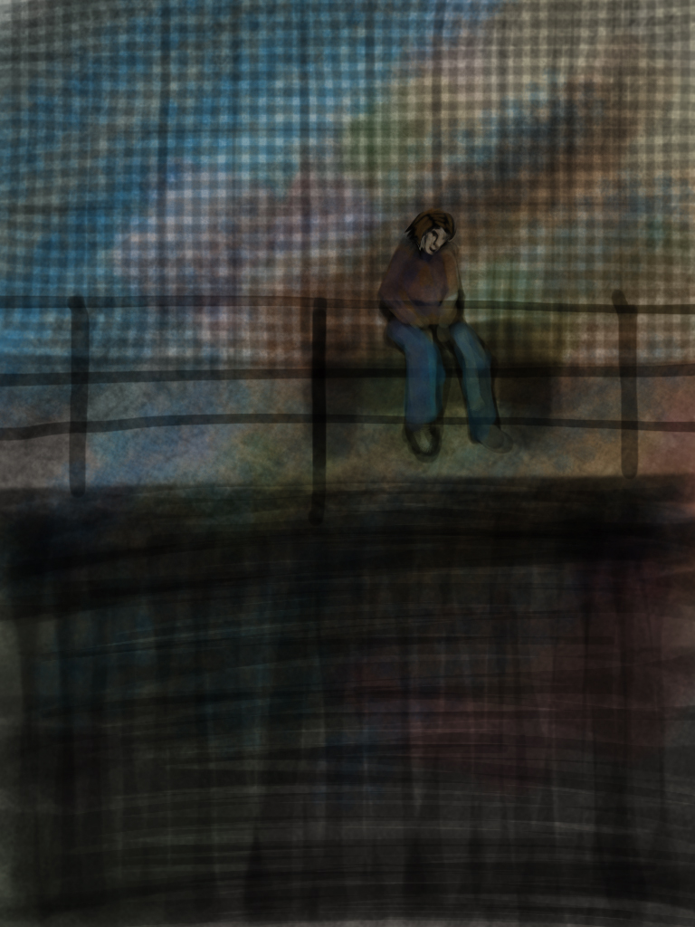
Displayed above is my final artwork. I decided to not use photoshop in the end as I felt I didn't have to, likewise I felt it would be fun to try seeing what the I-pad could do on its own. I am satisfied with the result, although there are some elements I would change if I went back and redo some areas such as the buildings. They were meant to be dramatic and non detailed, however a bit of refining in hindsight would not hurt.

An area I really liked however was the sky. it was very similar to how I remembered the actual sky, but this time a bit more fantasy like. In comparison to her environment, the woman stands out in my opinion, which is good as that is how she interacted with it in real life.

I like how it looks like she is either in deep thought or is just gazing into the distance, which is another part of her surrounding environment.

The technique for shading her face came from my fairly recent portrait of my friends face, which I feel has worked well, I also used this for the jumper, and I like the blending within it.

In conclusion I feel this final has been the end to a good learning experience for me.

(ps for easy browsing of my work, look to the labels at the top right of the page)

Quick sketches for final

Quick sketches and brush tests fir finals. I play around with mark making quite often before actually having a dedicated plan for any given area or texture.

Monday 23 April 2012

Visuals and more development

Displayed in this post are the development for my planned final.


The image on the left was a sketch over of the original picture, to check the anatomy. the other 2 were painted a bit more for 5 minutes and then resized to try different perspectives. I am happiest with the 3rd one as with the addition of the sky I feel the final will be atmospheric. The original pose was fine but i like it as a scene more now.

I plan to do the majority of the painting, as always on the brushes app for my ipad. The nearby fence however, as well as elements of the buildings in the background, will be taken into photophop for the more linear parts.

For the color pallet I shall be using cool colors, as the original scene was during a really cold day.

Plans for my final/ Proposal

After looking back at all of my work the above observational drawing was my favoirte. originally drawn through a caffe window, it depicted a young woman resting on the edge of an ice rink on a cold icey day. I really liked the direction she was looking, and the composition in general. As such I plan to develop this image into a final, as it will both focus on a person as well as their environment.

Before I put all the skills I have learnt for my I pad to use, I will do some visuals to play around with the composition some more, as there may be more still I can do for this image.


Sunday 22 April 2012

Success and Failure, experimentation.

As promised the other day I tried 2 different styles for the same image. I drew one of my friends, although I loosely drew the structure lines for both images quickly so i didn't have to worry about the expression being held.

The first image I spent an hour on. I used much bolder and solid colour than normal, and with minimal blending. I really like this effect, and feel I will develop this way of working for the final piece as well.
The actual peice itself is not perfect, But I feel it is defiantly an improvement.

However the next image is not successful at all in my opinion. I tried drawing my friend again in 15 minutes, like the traditional artist in my last peice did, however the anatomy is off and the shading no where near the traditional version. It was fun to try, however I now know it will be colour like the above I shall be attempting for my final.

Thursday 19 April 2012

Research part 2

2 more thoughts about my digital work hit me recently. Trying new things and getting inspiration from traditional work. for most of my studies and sketches I have used low opacity brush marks to help speed up the process of sketching, and I tried it once with an earlier image, however I plan to now try it again.
The above image is a 1 hour speed painting on photoshop from http://aurora-stylus.deviantart.com/
The artist here has used solid colour and a tight palette to blend the co,lour in her image, instead of using the same colour but at different strengths. I really like the effect it has on the characters hair and the skin on the face.

The traditional element I was talking about earlier was inspired by this. it has a great feel and mood, and the mark making is great. I'm not sure how I can recreate such an effect, but with I-pad and photoshop I intend to give it a try and see what I get.
By artist María Emegé

So now all that remains is to go down town and try these ideas...

Recent Updates

Hi again all. Now 220 and the essay are out of the way I can start uploading work I have been doing for this module again.

For todays post I decided to show 2 quick Ipad drawings.

The first is of 2 people at pizza hut. Creating shapes like tables is harder to do on an I-pad then photoshop, so I decided I should be merging the use of both programs more.
I did like the mood in this quick 5-10 minute piece though, from pizza hut.
 The next I-pad sketch is from my house. we were watching TV the other day, so I did this in 10 minutes. The faces are sketchy, but I like the colour pallete used. It feels slightly organic to me, like the colours I could see then.
Although I plan to go back and redo the faces on photoshop with my tablet, I did have some quick fun with filters and overlaying texture, to see how they effected the mood of the piece

.
Although not perfect, these do indeed add some interest at least. My next steps are to finalize ideas and techniques for my project, and start getting to the final.

Thursday 1 March 2012

Early research

For my first studies into the world of digital art, I decided to look at the work of other artists with the brushes app for Ipad. It is clear this way of working is still in its early days, but so far I have managed to find a few intresting finds

http://walyou.com/finger-painting-ipad-art-beyonce/
The vidoe in the above link is amazing, its a really realistic style, and i feel I can learn a lot with this artist. The most I have spent on an ipad drawing is 3 hours roughtly, so maybe if I spent this long on a drawing, i could compare myself with this style better.

http://paulaobrien.wordpress.com/2011/02/16/more-life-drawing-with-ipad-brushes-app/
This this link is another artist doing life drawing on an Ipad. Although I could never see myself working like this, I really enjoy some of the mark making going on here.

http://www.webdesignerdepot.com/2011/03/inspiring-artworks-created-with-the-brushes-app/
This site has a collection of Ipad drawing. By far my favorite is the image  "Route (lle de la Réunion) by jmhincky2007. Storm sky reflected in road."
 which I have also included here
http://farm6.staticflickr.com/5097/5394469771_6b4a715558_b.jpg

This is an image I wish to try and learn from.

I-padding it at the Barbican, and some thoughts.

"I-padding it" heh, I shall be remembering that term. Anyways yesterday I did some drawing out at the Barbican, as well as one more quickly done at home.


 The above 2 images are slight variations of the same thing. this was the first scene that I drew, where me and my friend were sat on various rocks. I wanted to draw the artist on location, which fits in with my theme of people and their environments. The top one is the original, and the bottom one has been slightly edited with photoshop, with a slight colour overlay and a filter applied.  I really like the slight changes the second one has, and i feel it makes all the difference.
The above image was another 5-10 minute drawing. It was of a man sitting at a bench looking out to the boats at the port. I like the environment he is in more than himself for this picture. 
The final I pad drawing of the day was this one of my house mate watching television and midnight snaking (its almost a tradition here now for us). 5 minutes or less, really tried doing this without him suspecting. And even better, I think it worked.I like the blocky colours I used here, the sketchyness comes from the black shading, instead of the overlayed colour.


And finnaly below I am showing another one of my more planned drawing. this was a drawing I did for fun with no reference. I love fantasy art, and always sketch like this, but only now am I doing this frequently on the ipad. This drawing took 2-3 hours, and is much more refined than the above sketches, however I have used the same principles, such as shading with low opacity balck brush marks followed by overlayed colour, however this time i placed colour uiderneath the black lines as well as an overlay on top. I think this has created a much bolder effect, and I really like it. I will be trying this method with a more refined drawing of real people next time I do 220 work with the Ipad. so now you know what to expect next, woo!


As well as more detailed life drawings, I will be showing my research here as well,so my train of thought is made clear.

Cheers!

Tuesday drawing out, the shopping centre

Displayed on this post are drawings I did on my Ipad at a shopping centre, sitting on the top floor with a burger and fries, looking down at all the different shoppers.It was a fun afternoon sessions.

The above image was a collarge of sorts. These were 3 different people walking at different times. I decided to add them all on the same image to both save space on my Ipad and create a scene at the same time that shows the busy nature of shoppers at drake circus. Each figure was 5 minutes, and although they are quite rushed, I still think its a fun excersise. I added some crazy colours on the top layer set to overlay at the end to tie the 3 of them together.
The above guy may well of been 5 minutes or less in total. Was really quickly drawing a manager/ security officer who was on the floor below me looking down to the ground floor. He looked like a hitman, so I am glad he did not see me draw him.

I wish I had drawn more at drake circus, and I may well go back to try and draw some of the busy shoppers, but I had other things to do after this, such as finals for 220, so I called it a day after this. however I have done more drawing since then, which I will show in a later post


Wednesday 29 February 2012

Drawing out with the Ipad

So me and a friend went to a cafe the other day and did some drawing out. I took my Ipad, and after some traditional sketches (which I will put in a later post) I created these. I had to sketch the outline of each person quickly, whilst I could still see them, then I added colour last, after I had captured as much of their character as possible.

This one took around 10 minutes. The woman was waiting around for some guy, boyfriend I assume. she had a big white bag over her shoulder and a red jumper under a brown coat with a furry collar. I used the technique of low opacity black marks and then overlaying colour on another layer. Lastly I went to the bottom layer and painted the background. for speed painting this method is not as good as a refined piece I feel, but I still liked the colours at least. 

This piece was another 10 minute one. A teenager/ young adult was resting on a post, on the edge of the ice arena. Here I used block colour with a few only a few touches of low opacity black to help blend a few areas, such as the jumper, or the background which I deliberately wanted out of focus. I think that using more solid colour for a quick drawing/ study of someone works much better, as it allows you to put information down faster.

I really enjoyed this drawing out session. My favourite by far was the second image. later today I shall be posting more of my drawing out I pad work. thanks for your time :)

Traditional life drawing

Traditional, on a digital blog? well this is my whole sketchbook, but online...
Anyway displayed below are works from the colour session of life drawing.


 The above Image I created with oil pastels. Whilst not my strong point, it was a fun experiment, and I enjoyed using slightly impressionistic lighting. This was the final image of the day. It was also an interesting and fun change to draw clothes this time on the model as well, as drawing the creases and folds in material is an entirely different path of thought that our usual sessions, where we mainly just think about lighting, and the movement in the human form.
The image i used for colour inspiration during the lesson was the following magazine cover.
 The above was a 10 minute chalk drawing to warm us up before the final drawing of the day (the one above this image) I really enjoyed trying to draw the model here, as I had to think how the figure was working under the baggy, form hiding clothes. difficult but a fun challenge.
 Started activity, draw rub out and redraw. about 10 times I think, 1 minute each.
Here was a colab done with the legendary Joe, find her work here

All in all it was an enjoyable class, and gave me some thoughts to leave with, such as colour and folds.

Monday 20 February 2012

Image and text Ipad drawings

For this lesson we worked with a text and asked the model to do different poses relating with the story. it was about a mouse and a lion, so we had poses relating to a massive lion and a small mouse.
These were all quick sketches, most around the 5 minute mark. Sketches 1,12 and 11 were ones I had 7 minutes for instead of 5 minutes, and I defiantly preferred them.

My least favourite was sketch 7, as I really struggled with the pose, and I am still not sure why. sketch 4 was another favourite, as I liked the simple shading on her back. Sketch 11 was cool as I tried going crazy with the hair, and made the ear look a bit more beastual, as I tried to anthropomorphise the model a bit.

Below is a video showing how I illustrated some of my sketches.

Sketch 12


Sketch 4


Sketch 2


Thanks for veiwng, next time I shall post some of my work from drawing out, both traditionally and on my Ipad 

My first dedicated life drawing.

Hi again, as my first post promised here is the first refined Ipad drawing I have done. I did it straight after the first lesson of the term in the evening. Its just some random fantasy elf concept I had, but I really enjoyed refining the details and doing the shading.


After creating the greyscale version, I decided that a colour version would be fun as well. so I created a new layer and set it to overlay, and then added colour on top. This way the shading of the greyscale is not lost, but the colour is simply changed. despite how much I like the coloured version though, I prefure the greyscale version, as for some reason it feels like it just has more character to me.

The greyscale took 3 hours on my Ipad, and then the colour version took and extra 15 minutes on a duplicated version of the original.

I was really enjoying working like this, so I shall show more Ipad work in future posts.

An introduction, weeks 1 and 2

Hi guys and Gals, this is my blog for illus 241. I decided to make one after a few weeks, so I had a backlog of things to show. I will be updating this blog regularly for the rest of the project. I chose the theme of digital after working with the Ipads in class. My first attempts during the first week/ first class (see below) were not too great, but I started to learn the basics, such as brush size and opacity. My next post will show the work I did after this class, as I have my own Ipad, I am able to keep on experimenting and learning. It is worthy of note though, I will be using Photoshop as well, But an Ipad is simpler to carry around and do drawing out, hard-drives tend to be very heavy...

Week 1
As you can see when I said basic, they really are. Both are sketches of my classmate Emmy. I feel as if the greyscale came out much better, and looks less like terminator. From this I decided to play around with greyscale more in the future.

week 2

The next week in life drawing class I created this image in 45 minutes. I really enjoyed working like this and started to find my still evolving digital style. My favourite element is the shading on this one. Here I kept painting over with multiple low opacity pen marks for shading. Before adding colour I keep switching between black and white, to correct and shade different areas. Lastly I add colours over the drawing on a new layer with a thin layer of colour.

All of these were done in the Ipad app Brushes

Thanks for visiting, next up my first refined drawing in the next post.